I recently came across Edward Tufte. He is the person who helped Amazon to drop the use of PowerPoint and switch to the 6 page memo.
After reading some of his writing, I decided to take a course he offers,” PRESENTING DATA AND INFORMATION” Link.
The course is just over 4 hours. It is some of the most useful time I’ve spent watching, disgesting, and learning. I ended it a little wiser. And, there is quite a bit of frustration. I’ve used some of the recommendations, like charts and visuals, at a rudimentary level for years, but nothing like the level Tufte shows is possible. I’ve got a lot of time to catch up on.
Tufte’s advice resonated with me. I remember too many times working for MEPs or the Commission when interests would present disingenuous data and information to support their case. My political antenna in my gut would go off, and lo and behold, the highly self-selective use of data/evidence would present itself for all to see. From then on, I have an aversion to such selective citation. Tufte helps explain why I have this reaction.
Why clear presentations will help a lobbyist
As a lobbyist, an important part of your job is to present information to your audience – clients, officials, politicians – so they understand it. If the audience does not understand the information, you have failed.
And, it would appear that failure to be understood by your audience is all too common in Brussels (and maybe in other capitals). Some lobbyists speak a language to their clients, politicians and officials that is so complex and arcane I have no idea what they are talking about. When I’ve encountered it, I wonder if the Holy Spirit has taken hold of them, and they are speaking in tongues. Sadly, many lobbyists find speaking in technical tongues demonstrates credibility. As Tufte suggests, it does not.
And presenting clear data and information is vital in still slightly technocratic Brussels. The public consultation process of Better Regulation gives many chances to bring good quality data and information to the table to inform public policy preparation. One of the reservations I have heard from officials is that many submissions on Have Your Say are data and evidence-poor and often amount to recitations of faith. I know of stand-out cases – when original, high-quality, objective data was brought to the table early, presented clearly, and mirroring the Commission’s guidelines – that led to changes in the policy proposals. Looking at those examples now, it looks like many of Tufte’s recommendations were taken on board.
Tufte provides some helpful advice on making the information you present clear and credible.
Some of My Take Aways
Some of the key points I took away from the course follow. Many will likely be offended by what follows. I have simply taken what Tufte says.
- A chart can present information more fully and clearly than writing alone.
- Your presentations can take many forms – the dreadful PowerPoint, a memo, position paper, talk, or article.
- Your presentations should not contain clutter, confusion, or overload. If they do, they are simply the symptoms of poor design or poor thinking.
- Your presentation is a moral and ethical act. You are conveying your content and establishing your credibility.
- The reader is looking at your presentation’s content and substance and asking if they can believe what you are saying.
- When you show information, your job is not to dumb things down, your job is to make everybody who looks at it smarter.
- In one presentation, you can provide information to serve different constituencies, and you can use words, numbers, and visuals.
- Maps, especially Google Maps, give you a good idea of how much data you can present.

- Focus on the content. It is the only reason why people are reading/listening to you.
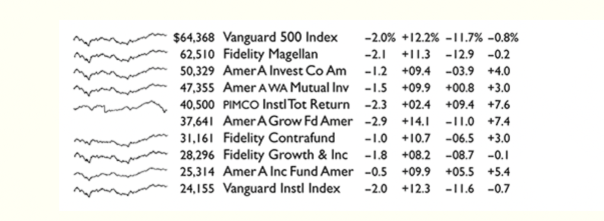
- Sparklines are a good way to convey information.
Source:https://www.edwardtufte.com/bboard/q-and-a-fetch-msg?msg_id=0001OR
11. If you know something really well, you are able to explain it in ordinary language. If you can’t, and you rely on jargon, and you can’t explain something in ordinary language, you probably don’t really understand it.
12. Avoid summaries full of bullshit jargon stuff.
13. Avoid cherry-picking or manipulating the model to give the answer you wanted from the start.
14. Prove you are not cherry-picking by providing the full data. Don’t trust people showing you truncated, summarised data.
15. If people won’t show you the data, they are likely afraid to show you that data/evidence.
16. People have the ability to scan over a large amount of information and find the diamonds in the swamp.
17. PowerPoint is a poor means to communicate information. Don’t use it.
Steve Jobs.
18. Make sure that your presentation considers the data/evidence against you. It strengthens your case.
19. “The biggest problem in communication is the illusion that it has taken place” George Bernard Shaw
20. A good diagram is worth 5,000 words.
21. Act with integrity, the truth matters. If you don’t, your credibility will be harmed, and your credibility is all you have.
If lobbyists followed Tufte’s advice, I guess they’d increase the likelihood of their positions being taken up a 100X.